Japandi Color Scheme × Earth Tone Palette Interior Tips for Each Room Part 1
Japandi interiors have become synonymous with balance, the calm restraint of Japanese minimalism meets the warmth of Scandinavian coziness. As the style continues to evolve, the focus is shifting from general color palettes to the subtle harmony of earth tones, which form the foundation of a truly serene and grounded interior.
Earth tones represent the natural world: sun-baked clay, forest moss, sand, stone, and sky. These hues embody the wabi-sabi philosophy of finding beauty in imperfection and the hygge spirit of comfort through warmth. Within Japandi interiors, they serve as grounding elements that connect spaces to nature while maintaining a sense of calm refinement.
This article explores the essence of Japandi earth tone palettes, offering color combinations, layering strategies to help you create a harmonious and naturally inspired home.
Popular Japandi Earth Tone Palettes
Japandi earth tone palettes draw inspiration from raw, natural materials: wood, clay, linen, stone, and foliage. The colors often range from soft beige and mushroom gray to ochre, rust, moss, and muted blue. Their matte, desaturated nature fits seamlessly with the minimal, natural aesthetic of Japandi interiors.
Unlike vivid or high-contrast palettes, earth tones are about subtle gradations — the interplay between warm and cool undertones that reflect the calm of nature. These hues pair beautifully with Japandi materials such as ash wood, rattan, and washi paper, allowing textures to take center stage.
Earth colors are essential to the Japandi palette because they embody the natural harmony both Japanese and Scandinavian cultures cherish. In Japanese design, muted tones inspired by soil, stone, and wood reflect the wabi-sabi appreciation for imperfection. In Scandinavian interiors, warm neutrals and browns echo comfort and connection to nature. Together, these shades create a quiet equilibrium — grounding a minimalist space without stripping away warmth.
Japandi Earth Tone Color Ideas
Earth tones are at the heart of Japandi interiors, offering a palette that feels simultaneously natural, calming, and timeless. Rather than following fleeting trends, these hues reflect the essence of the design: simplicity, warmth, and a close connection to nature. When layered thoughtfully, they create depth without clutter, using contrast and texture to evoke quiet sophistication.
Start with grounding tones like beige, taupe, or clay as your base, then build layers through textiles, wood finishes, and accent pieces in complementary shades. A moss-green throw, terracotta cushion, or slate-gray vase can introduce subtle rhythm while maintaining harmony. Natural materials—linen, rattan, stone, and ceramics, enhance these colors' organic appeal, while warm, diffused lighting highlights their soft gradations.
From warm and vintage palettes to muted, green, or blue variations, each color family brings its own mood and spatial character. The following sections explore these Japandi earth tone palettes in detail—how they look, where they fit best, and how to combine them for effortless cohesion across every room.
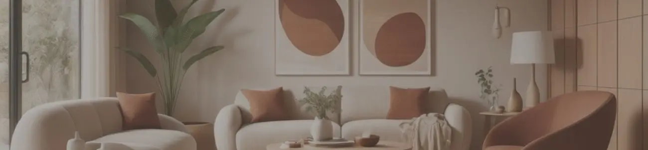
Warm Earth Tone Color Palette
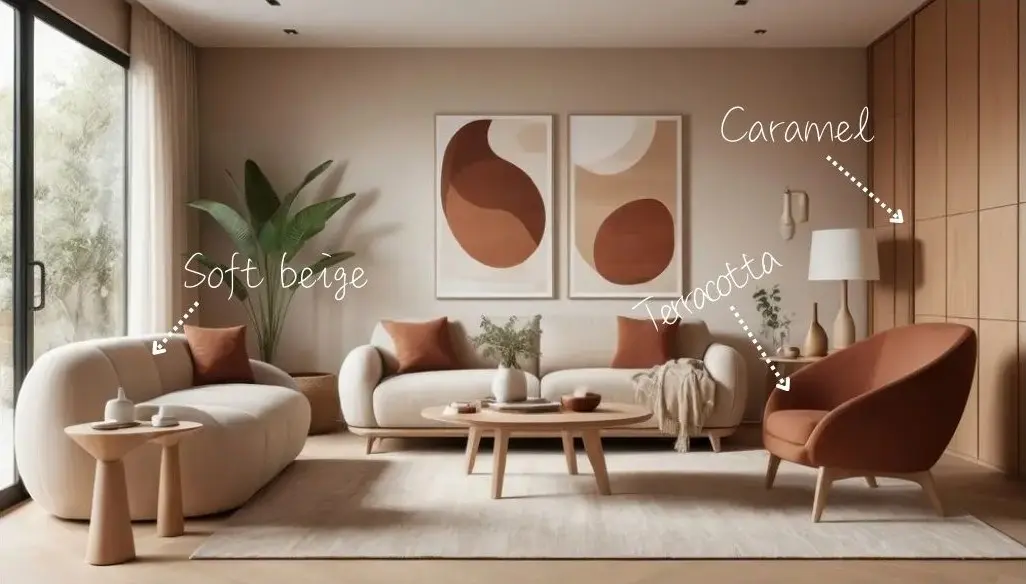
Warm earth tones include shades like terracotta, caramel, soft beige, and sandy browns. These hues feel cozy, inviting, and subtly energizing without overpowering a space. They align perfectly with the Scandinavian side of Japandi, emphasizing warmth and hygge, while muted saturation ensures the Japanese minimalist aesthetic is preserved. These tones work well on large furniture such as sofas, accent walls, and rugs, while also enhancing natural wood and woven materials. Layering cushions, throws, or ceramics in complementary shades deepens the sense of warmth. Living rooms and dining areas benefit most from warm earth tones, as they foster a welcoming, grounded atmosphere for social interaction and relaxation.
Earth Green Color Palette
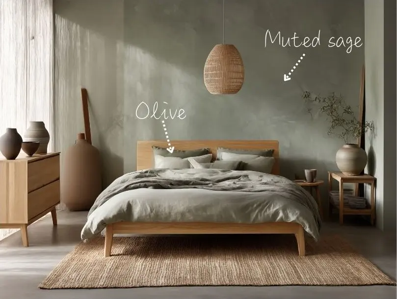
Earth greens encompass moss, olive, muted sage, and forest-inspired shades. They evoke freshness, restoration, and a strong sense of connection to nature. Earth greens reinforce the Japanese emphasis on biophilia and the Scandinavian desire for serene, nature-infused interiors. Their low-saturation quality ensures they remain calming rather than bold. Ideal for walls, cabinetry, textiles, or accent pieces, these greens pair beautifully with light or medium-toned wood. Incorporating indoor plants alongside green elements amplifies the natural, organic feeling of the space. Bedrooms, bathrooms, and kitchens thrive with these colors, creating tranquil, restorative environments.
Earth Tone Vintage Color Palette
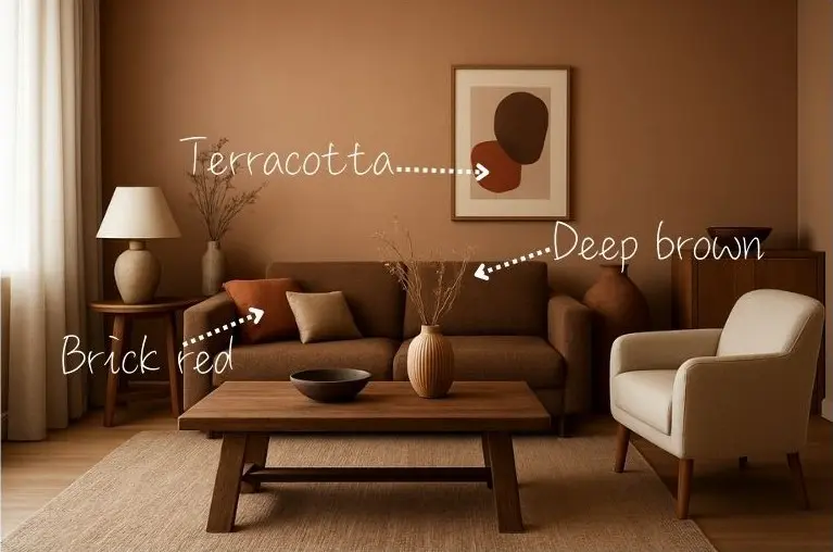
Vintage earth tones include deep browns, ochres, brick reds, and muted terracotta. These shades convey depth, nostalgia, and understated sophistication. Their matte, muted finish complements Japandi minimalism while introducing a sense of layered richness and tactile interest. They are perfect for feature walls, antique-inspired furniture, or decorative accents such as ceramics, frames, and textiles. Combining them with natural wood and linen enhances textural contrasts and visual warmth. Study rooms, living rooms, or entryways are ideal, as these colors impart a sense of history, refinement, and mature warmth.
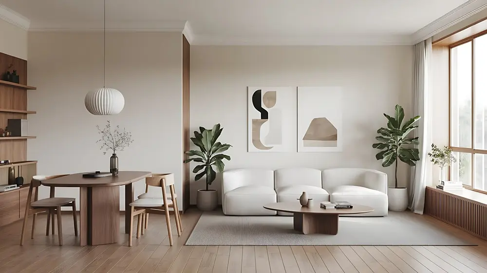
Bright Earth Color Palette
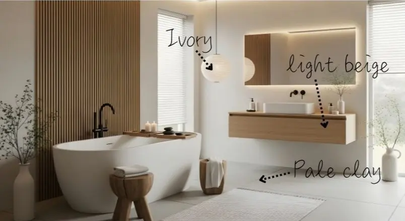
Bright earth tones feature sand, pale clay, ivory, and light beige. These hues are airy, luminous, and enhance the perception of space. They reinforce Japandi's minimalism and uncluttered aesthetic by creating a neutral canvas that amplifies natural light and highlights textures. Walls, ceilings, and larger furniture pieces in these tones open up the space visually. Accents in slightly darker earth shades can create subtle depth without disrupting harmony. Bathrooms, entryways, or compact apartments benefit from bright earth tones, keeping interiors light, open, and serene.
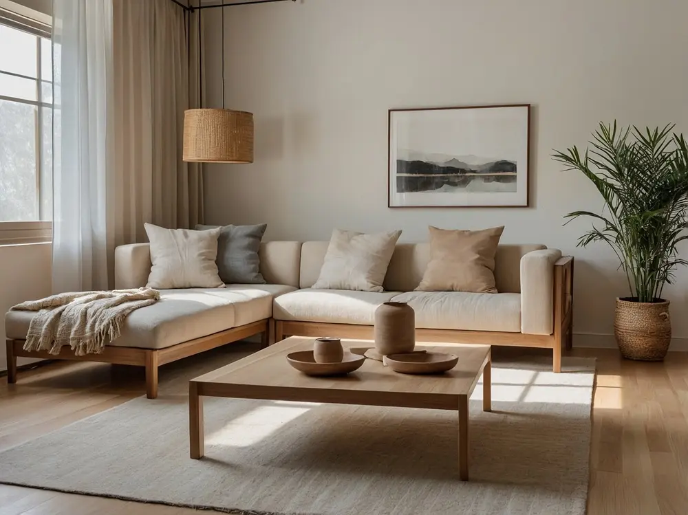
Muted Earth Tone Color Palette

Muted earth tones include dusty taupe, soft stone gray, and faded terracotta. These colors provide understated calm, neutrality, and a versatile backdrop. Their subtlety allows textures and materials to take center stage, maintaining the minimalist, natural aesthetic central to Japandi design. Ideal for walls, large furniture, or upholstery, muted earth tones balance accent colors and prevent visual clutter. Combining with wood, linen, or ceramics enhances tactile depth. Living rooms, bedrooms, and workspaces where calm, unobtrusive environments are desired.
Pastel Earth Tone Color Palette
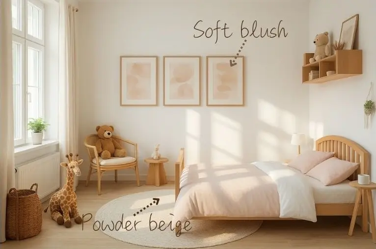
Pastel earth tones include soft blush, powder beige, and misty sage. They offer gentle warmth, delicate color, and a modern softness while remaining subdued. Pastels complement minimalism while introducing subtle variation that does not overwhelm the serene atmosphere. Ideal for textiles, small furniture, cushions, or decorative ceramics. These colors pair well with natural wood and linen fabrics to maintain understated elegance. Nurseries, study corners, or creative nooks benefit from pastel earth tones, creating calm, nurturing, and inspiring spaces.
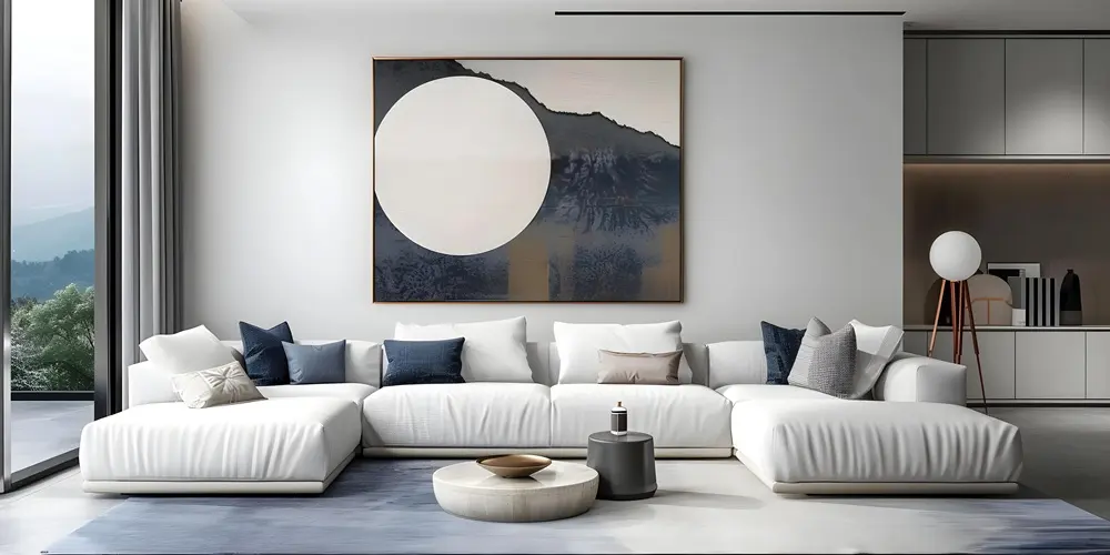
Blue Earth Tone Color Palette
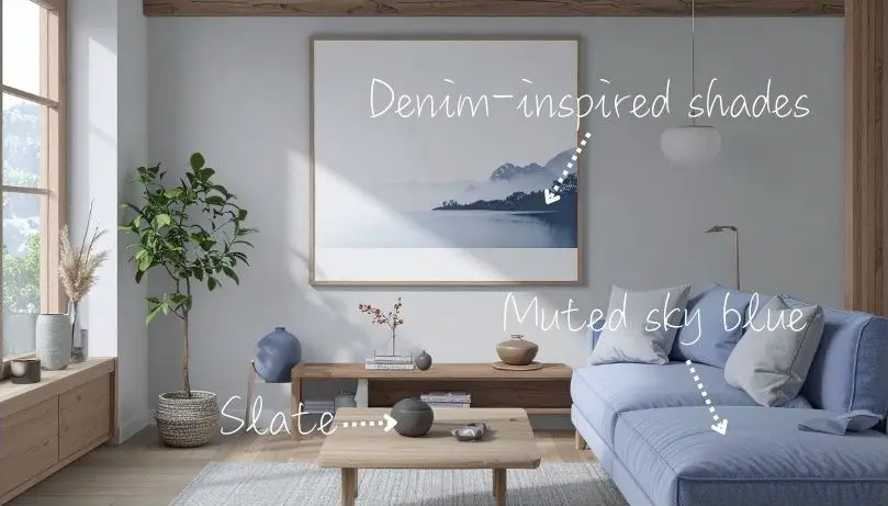
Blue earth tones include muted sky blue, slate, and denim-inspired shades. These hues introduce cool contrast and a reflective, meditative feeling within otherwise warm earth palettes. Blue earth tones balance the warmth of wood and beige elements, adding serenity while remaining harmonious with the natural, low-saturation ethos of Japandi. Effective for walls, tiles, accent furniture, or textiles. Pairing with neutral fabrics and natural wood ensures the palette stays cohesive and soothing. They are ideal for bathrooms, bedrooms, and living rooms, where serenity and balance are key. In living rooms, touches of blue in cushions, artwork, or ceramics can add a gentle contrast that enhances warmth and sophistication without disrupting the Japandi calm.
Japandi Earth Tones: Balance, Warmth, and Authenticity
Earth tones in Japandi interiors are more than aesthetic choices, they reflect a lifestyle rooted in balance, mindfulness, and a deep appreciation of nature's quiet beauty. Thoughtful combinations of harmonious colors, layered textures, and harmonious lighting create spaces that feel cohesive, grounded, and serene. Japandi earth tone design invites calmness, authenticity, and timeless charm into your everyday life.
Continue the journey in our upcoming article, Japandi Color Scheme x Earth Tone Palette Interior Tips for Each Room Part 2, where these palettes are brought to life with room-by-room Japandi design ideas.
*Some of the images featured in this article were created using generative AI.