

Japandi Color Palette Ideas: Create Harmony and Balance in Your Home
- The Foundations of the Japandi Color Palette
- The Color Theory Behind Japandi
- Creating Your Perfect Japandi Color Palette
- Room-by-Room Japandi Color Palette Guide
- Seasonal Adjustments for Your Japandi Color Palette
- 5 Tips for Incorporating the Japandi Color Palette
- The Seamless Integration of Color, Culture, and Materials
- Frequently Asked Questions
Japandi design is known for its calming simplicity, bringing together the refined minimalism of Japanese interiors with the warmth and functionality of Scandinavian living. At the heart of every Japandi space is the carefully curated color palette, a thoughtful blend of soft neutrals, earthy tones, and natural contrasts.
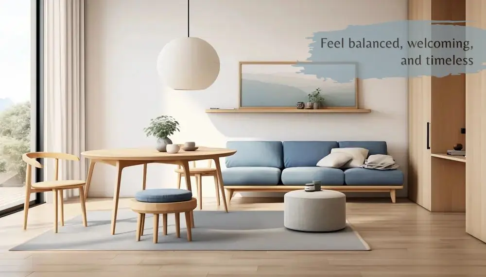
Instead of bold statements or fleeting trends, the Japandi color palette embraces muted neutrals, earthy tones, and subtle contrasts inspired by nature. These colors work together to create interiors that feel balanced, welcoming, and timeless.
Color also plays an important role in how a room feels and functions. Soft, harmonious palettes can make compact spaces appear larger, reduce visual clutter, and foster a greater sense of well-being. Combined with natural materials and thoughtful lighting, the right colors create an environment that is both beautiful and comfortable for everyday living.
In this guide, we will explore the principles behind the Japandi color palette, explain why these colors work so well together, and share practical tips for applying them throughout your home.
The Foundations of the Japandi Color Palette
The Japandi aesthetic is deeply rooted in simplicity, natural harmony, and intentional design. Its color palette reflects these principles by drawing inspiration from the natural world, and blending the minimalist elegance of Japanese design with the cozy warmth of Scandinavian interiors.
Key Principles of the Color Palette
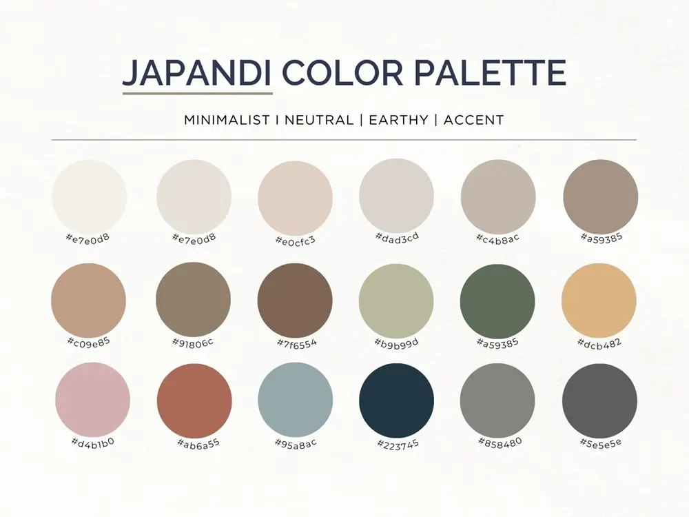
Neutral tones are the cornerstone of the Japandi color palette. They serve as the perfect backdrop, creating a sense of calm and balance while allowing other design elements to shine. Common base colors include beige, cream and taupe.
Accent colors in the palette are inspired by nature, such as earthy greens, muted blues and warm browns. These colors add depth, warmth, and a grounding effect to your spaces.
In addition, contrast plays a vital role in achieving harmony in Japandi design. Light and dark shades are paired to create a visually compelling yet understated aesthetic. For instance, pairing creamy whites with charcoal or black accents.
Cultural Influences on Japandi Colors
The color choices in Japandi interiors are influenced by two distinct but complementary cultural philosophies, namely Japanese wabi-sabi and Scandinavian hygge.
Wabi-sabi emphasizes muted, natural tones that reflect the impermanent nature of life and the inherent beauty of simplicity. Muted greens and browns reflect the natural landscape, particularly plants, moss, and trees, which change and evolve. Gray tones evoke the appearance of aged stone or softened metal, further emphasizing the passage of time. Soft neutrals like beige, taupe, and off-white remind us of the inherent beauty of the ordinary.
Hygge, a Danish concept that can be loosely translated as "coziness," focuses on creating spaces that foster comfort, warmth, and a sense of well-being. Shades of cream, soft blues, gentle grays, and warm, earthy tones are often used to promote relaxation and a sense of peace.
Materials and Textures That Complement the Palette
Both Japanese and Scandinavian design cultures have a long history of valuing natural materials that complement their minimalist aesthetics. Materials such as wood, linens, wool , cotton as well as ceramics and stone play a crucial role in bringing warmth, depth, and texture to the space while also enhancing the calm, balanced mood created by the color palette.
The Color Theory Behind Japandi
The Japandi color palette may appear effortless, but its harmony is rooted in fundamental color theory. Rather than relying on bold statements, Japandi interiors use subtle variations in hue, tone, and saturation to create spaces that feel balanced and visually calming. Understanding these principles makes it easier to build a cohesive palette that remains timeless.
The Low-Saturation Principle
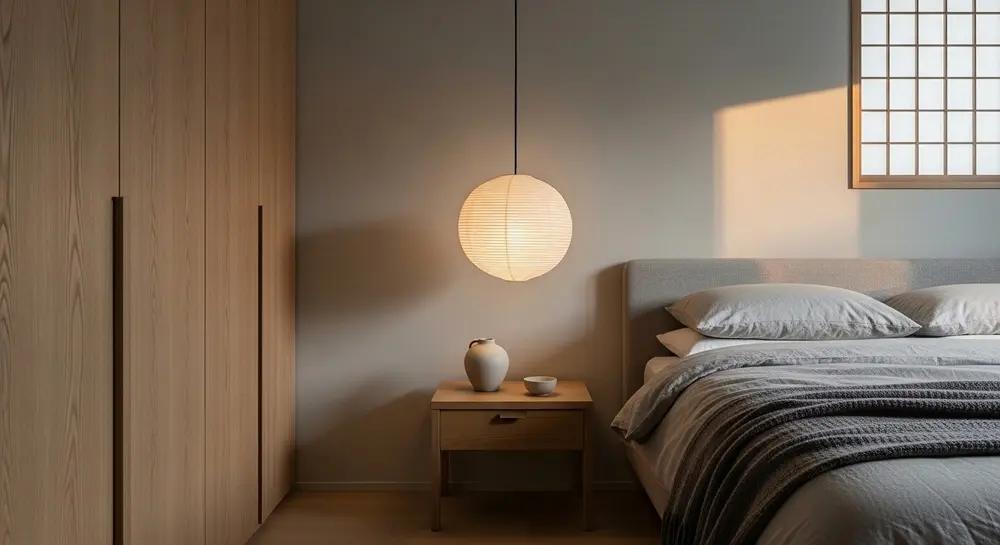
One of the defining characteristics of Japandi colors is their low saturation. Instead of bright, highly pigmented colors, the palette favors softened hues that feel closer to those found in nature.
Imagine the muted green of eucalyptus leaves, the weathered gray of stone, or the warm beige of unbleached linen. These colors contain less intensity, making them easier on the eyes and more relaxing to live with.
Low-saturation colors also complement one another naturally. Since no single color dominates the room, attention shifts toward the beauty of natural materials, thoughtful craftsmanship, and carefully selected furnishings.
The 60-30-10 Balance Rule
A useful guideline when creating a Japandi palette is the 60-30-10 rule, a classic interior design principle that helps achieve visual balance.
60% Primary Color is the dominant neutral shade used on walls, ceilings, or large furniture pieces, and warm white, beige, greige, or light gray create a calm foundation.
30% Secondary Color is a complementary tone that adds depth through cabinetry, upholstery, curtains, rugs, or flooring, and warm wood finishes and muted earth tones often fill this role.
10% Accent Color is a restrained pop of color used in accessories, artwork, lighting, ceramics, or cushions, and sage green, charcoal, muted blue, or terracotta introduce character without overwhelming the space.
The goal is not to follow the percentages rigidly, but to ensure one color never competes with the others. Every element should contribute to an overall sense of harmony.
Warm vs. Cool Undertones
Not all neutrals are the same. Two shades of white or gray may appear similar, yet their undertones can dramatically change the atmosphere of a room.
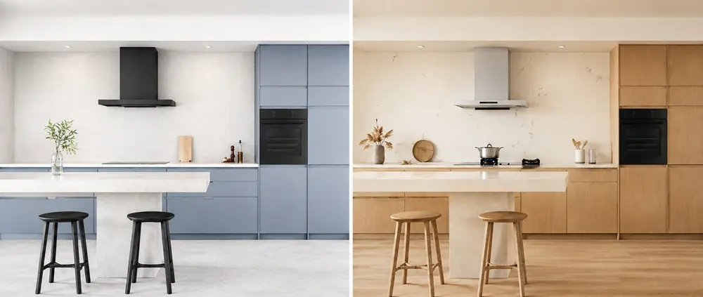
Warm undertones such as cream, ivory, beige, and greige, create interiors that feel welcoming and comfortable. They pair beautifully with natural timber and are often preferred in Japandi homes because they soften minimalist spaces.
Cool undertones including crisp white, cool gray, and blue-gray, offer a cleaner, more contemporary appearance. When used thoughtfully, they can brighten smaller spaces or balance darker wood finishes. However, using too many cool tones without introducing natural materials may result in a space that feels sterile rather than inviting.
A simple way to maintain harmony is to choose one dominant undertone and repeat it consistently throughout the room.
Tonal Harmony Over Strong Contrast
Unlike many contemporary interiors that rely on striking black-and-white contrasts, Japandi emphasizes tonal layering. This means using different shades within the same color family to create depth while maintaining visual calm.
For example, a living room may combine ivory walls, beige upholstery, oak furniture, and walnut shelving. Although each element differs slightly in tone, they work together seamlessly because they share similar warmth.
Dark accents still have an important role. Black lighting fixtures, charcoal ceramics, or dark walnut furniture provide definition and prevent the palette from feeling flat. The key is moderation—contrast should guide the eye, not dominate the space.
Likewise, Japandi avoids elements that disrupt this sense of harmony. Glossy finishes, neon colors, and strong primary hues can feel visually jarring, drawing attention away from the natural materials and understated elegance that define the style. Instead, matte finishes, muted colors, and gentle tonal transitions allow texture and craftsmanship to become the focal points of the space.
Natural Pigment Logic
Japandi colors are inspired by pigments traditionally found in nature rather than synthetic or highly saturated dyes.
Earth, clay, charcoal, sand, stone, wood, and plants have long influenced both Japanese and Scandinavian design traditions. Their colors age gracefully, complement natural materials, and remain visually appealing over time.
Drawing inspiration from nature also makes it easier to mix colors confidently. Beige pairs naturally with warm timber because both originate from earthy tones. Muted greens complement stone and linen because they share similar organic qualities. This inherent compatibility creates interiors that feel cohesive without appearing overly coordinated.
Creating Your Perfect Japandi Color Palette
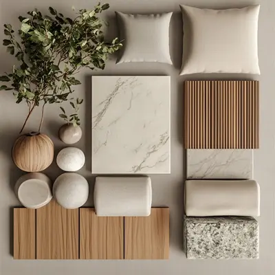
Creating a Japandi color palette begins with understanding how light, materials, and daily living influence the way colors are experienced in a space. Rather than selecting paint colors in isolation, Japandi design takes a holistic approach—considering natural daylight, wood tones, stone surfaces, textiles, and the function of each room. By building the palette around these elements and avoiding overly saturated or harsh combinations, it becomes easier to create a home that feels cohesive, calming, and naturally balanced.
Key Principles of the Color Palette
Lighting has a significant impact on how colors appear.
Rooms with abundant sunlight tend to make colors look brighter and warmer. Soft beige walls may appear almost cream during the afternoon, while warm wood develops a rich golden glow.
Spaces with limited daylight or north-facing windows often receive cooler light, causing whites and grays to appear slightly blue. In these rooms, warmer neutrals such as ivory, greige, or taupe help maintain a welcoming atmosphere.
Artificial lighting also changes the appearance of colors. Warm lighting enhances earthy tones and timber finishes, while cooler lighting can make neutral colors feel flatter and less inviting. Whenever possible, test paint samples under the lighting conditions used throughout the day before making a final decision.
Build Around Materials
In Japandi interiors, materials often determine the color palette rather than the other way around.
Light oak naturally pairs with warm whites and soft gray, while walnut complements beige, charcoal, and earthy green. Stone surfaces introduce cool, organic tones, and textured linen adds softness even within a monochromatic palette.
Selecting materials and colors together creates a more cohesive result than treating them as separate design decisions.
Choose Colors That Support the Room's Function
Every room serves a different purpose, and the color palette should reinforce how the space is used.
Living areas often benefit from warm neutrals that encourage relaxation and conversation. Bedrooms may use softer tones that promote rest, while kitchens feel fresh with brighter neutrals balanced by warm timber and subtle earthy accents.
Rather than repeating the exact same palette throughout the home, maintain a cohesive look by using consistent undertones and natural materials across different spaces. Adjust the depth and intensity of accent colors to suit each room's function, while aiming for gentle transitions between colors. This allows texture, craftsmanship, and natural materials to become the focal points, creating a harmonious home that feels connected from one room to the next.
Color Combinations to Avoid
Although Japandi embraces simplicity, some color combinations can disrupt its sense of balance.
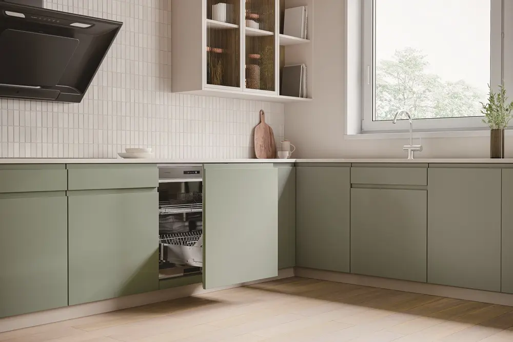
Avoid pairing multiple highly saturated colors within the same space, as they compete for attention and reduce the calm atmosphere. Stark black-and-white schemes without warm materials can also feel overly clinical.
Instead, aim for gentle transitions between colors, allowing texture, craftsmanship, and natural materials to provide visual interest.
Room-by-Room Japandi Color Palette Guide
While the principles of the Japandi color palette remain consistent throughout the home, each room has its own purpose and atmosphere. Thoughtfully adapting your palette to suit different living spaces helps create a home that feels cohesive while supporting everyday comfort and functionality.
Living Room: Warm and Welcoming
The living room is often the heart of the home, where relaxation and socializing come together. The Japandi style encourages creating a tranquil and inviting environment with a balance of warm, neutral tones and natural materials.
Keep the wall colors neutral (warm whites, light grays, or soft beiges), with subtle contrasts in furniture and textiles. Choose furniture with warm earthy accents that create a sense of coziness. Muted greens, warm browns, and deep blues add depth and personality without being too bold. Incorporate natural textures such as linen cushions, wool rugs, and wooden furniture.
Bedroom: A Calm Sanctuary
The bedroom is a sanctuary for rest and relaxation, therefore the color palette should reflect a sense of calm and serenity. Soft, neutral tones and muted accents promote restful sleep while adding warmth and character to the space.
Select soft neutrals like ivory, off-white, or light gray for the walls, along with secondary soft, muted shades that evoke peace and comfort. Pale blues, soft greens, and pastel pinks can be applied in soft furnishings, such as bedding, pillows, or rugs. Include darker accents to add depth and sophistication. A deep walnut bed frame or a charcoal gray side table can balance out the lighter tones.
Kitchen: Bright, Functional, and Natural
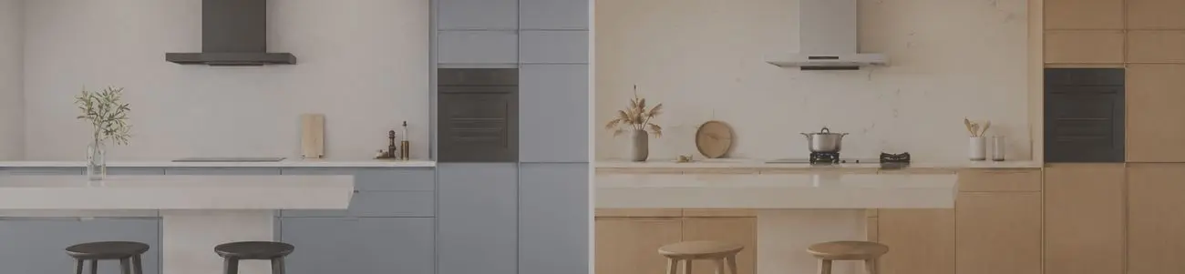
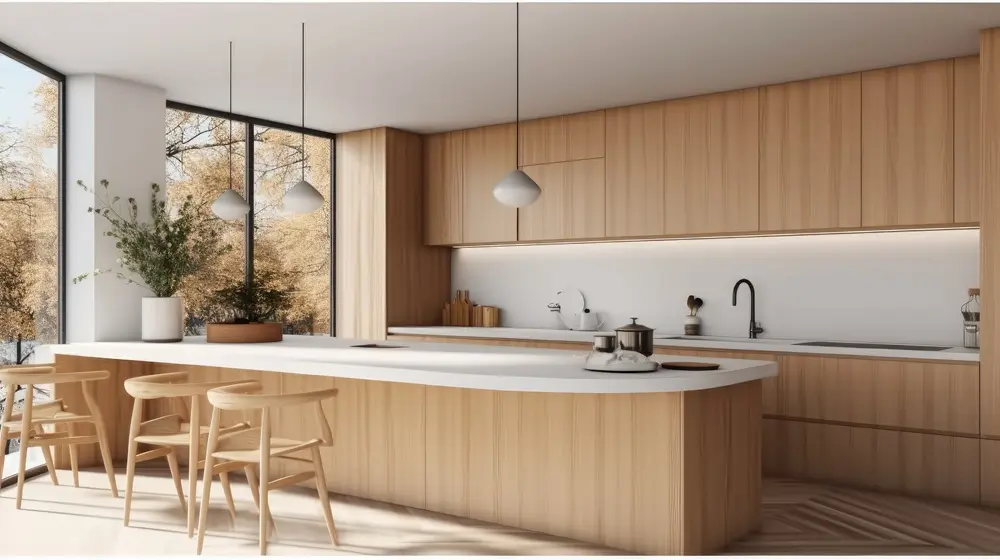
A Japandi kitchen combines function and beauty in an inviting space with a neutral base and warm, earthy tones. The kitchen should be bright and airy, so opt for crisp whites or light grays as the main color for cabinetry, walls, and countertops. These hues help to open up the space, making it feel larger and cleaner.
Introduce earthy greens, soft blues, and terracotta tones through accessories like dishware, textiles, and plants. These colour accents bring warmth and visual interest without overwhelming the space. Wood also plays a major role in Japandi kitchens; wooden bar stools, open shelving, or a wooden dining table can bring an organic feel to the kitchen.
Bathroom: A Spa-Inspired Retreat
The bathroom in a Japandi home should feel like a serene, tranquil retreat. Light, airy tones, combined with earthy textures and materials, create a minimalist sanctuary perfect for unwinding.
White, soft gray, or muted beige should dominate the walls, creating a calming, spa-like atmosphere. Earthy greens, muted blues, and natural wood tones also work beautifully in the bathroom. These colors can be introduced through accessories like towels, bath mats, and plant pots.
To add a sense of sophistication and depth, incorporate darker tones in small doses. A dark wood vanity, charcoal gray shower tiles, or a black-framed mirror will create contrast and balance the lighter elements.
Seasonal Adjustments for Your Japandi Color Palette
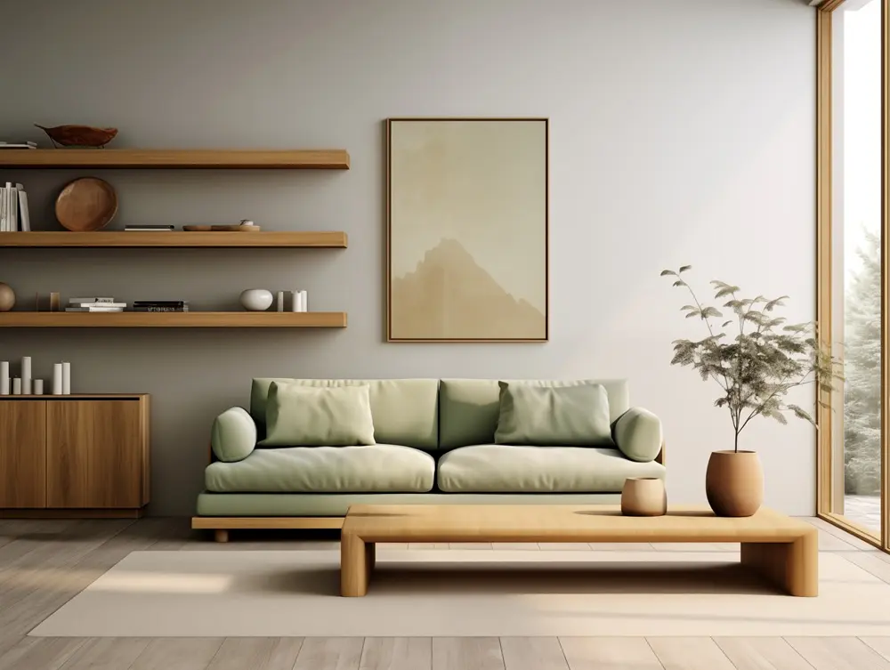
The Japandi design style is inherently adaptable and it naturally evolves with the seasons. While Japandi favors timeless, neutral tones and natural materials, adjusting the color palette according to the changing seasons can enhance the warmth, light, and mood of your space, creating a cozy and balanced environment year-round.
Spring: Embrace Freshness and Renewal
Spring brings a sense of renewal and growth. As nature begins to awaken with blossoming flowers and bright, clear skies, your Japandi color palette should reflect the same lightness and fresh energy. The spring season calls for soft, calming tones such as light cream, warm white, and soft taupe, coupled with accent colors like soft sage green, pale lavender and light blue.
Summer: Warmth and Comfort with a Touch of Coolness
Summer is about warmth, relaxation, and enjoying the outdoors. The Japandi palette in summer emphasizes warm, earthy tones with accents that evoke coolness. Think of light, airy shades like light greys, off-whites, and beige. You can also add deeper tones like soft blues and terracotta.
Autumn: Cozy Warmth and Rich Earth Tones
Autumn is a season that evokes warmth, introspection, and comfort. This is the perfect time to incorporate warm, deep colors that create a cozy, enveloping atmosphere. Keep your base neutral colors but add warmth with deeper shades of beige, taupe, and warm grays. Rich, autumn-inspired shades such as deep oranges, mustard yellows, warm browns, and burnt reds create a cozy and welcoming space.
Winter: Embracing Warmth, Comfort, and Subtle Contrast
Winter is the season of coziness and reflection. A Japandi winter color palette should emphasize warmth, comfort, and a sense of serenity. Soft whites, muted greens, and deeper hues create a peaceful atmosphere. Richer, deeper tones such as navy blue, forest green and burgundy work well as winter accent colors, creating an inviting, intimate space.
These seasonal updates require only small changes to accessories rather than major renovations, allowing the core Japandi palette to remain timeless throughout the year.
Looking for ready-made palette ideas? Explore our Japandi Color Scheme Guide, featuring Warm Earth, Earth Green, Vintage, Bright, Muted, Pastel, and Blue Earth color schemes, along with room-by-room styling inspiration.
5 Tips for Incorporating the Japandi Color Palette
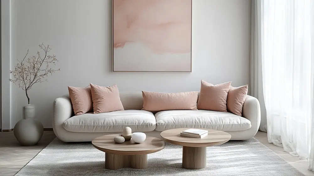
Incorporating the Japandi color palette into your home involves more than just picking color, it is about creating a space that feels natural, grounded, and tranquil. Here are some actionable tips to help you seamlessly integrate the Japandi color palette into your space.
(1) Incorporate Subtle Pops of Color
While the Japandi style emphasizes muted tones, small pops of color can bring personality to the space without disrupting the overall harmony. These pops should still feel natural and understated.
Introduce these colors through smaller items like artwork, vases, or throw pillows.
(2) Layer Textures for Depth
Integrating a variety of textures in the decor prevents the Japandi palette from feeling flat or sterile. Use soft textiles, rough ceramics, and smooth wood finishes to create layers of visual interest within the same color scheme.
Keep the palette cohesive by sticking to a similar color family when layering textures.
(3) Embrace Natural Materials
Japandi design is deeply rooted in a connection to nature. Incorporating natural materials like wood, linen, wool, rattan, and stone not only enhances the Japandi color palette but also adds texture and warmth.
Match the tones of natural materials with your color palette. For instance, pair light wood furniture with a neutral base or complement dark walnut with charcoal and beige tones.
(4) Choose Minimalist and Functional Decor
Japandi design values intentionality, so every piece in the room should serve a purpose. Additionally, choose functional decor items which align with the color palette.
(5) Use Soft, Natural Lighting
Lighting plays a crucial role in bringing out the subtle beauty of the Japandi color palette. Choose lighting fixtures that complement the natural tones and materials in your space.
Use warm light bulbs and avoid harsh, bright white lighting to maintain a cozy atmosphere.
The Seamless Integration of Color, Culture, and Materials
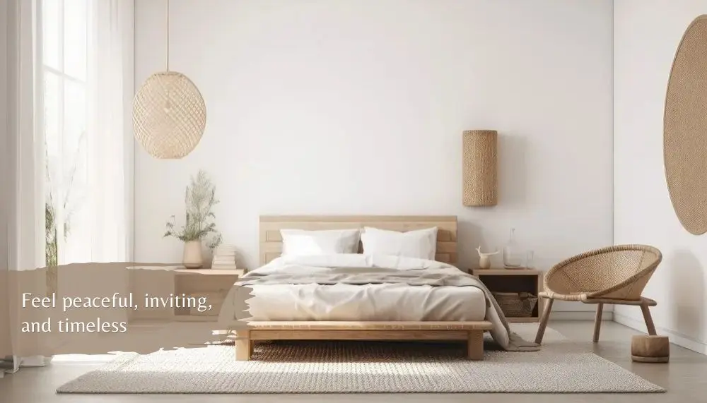
The Japandi color palette is more than just a collection of colors; it is a reflection of cultural philosophies and an intentional design approach. The embrace of imperfection through wabi-sabi, combined with the warmth and comfort of hygge, creates a palette that is rich in depth and meaning. These colors come to life when paired with natural materials, fostering a space that feels peaceful, inviting, and timeless. By mastering its foundations and adapting it to your space, you can craft a Japandi-inspired home that is not only aesthetically pleasing but also emotionally nurturing.
Frequently Asked Questions
What is the Japandi color palette?
The Japandi color palette is a collection of soft neutrals, earthy tones, and muted accent colors inspired by Japanese and Scandinavian design. Common colors include warm white, beige, greige, taupe, light gray, sage green, olive, terracotta, charcoal, and natural wood tones. Together, these colors create interiors that feel calm, balanced, and connected to nature.
Beyond their visual appeal, Japandi colors also have a strong psychological effect. Their low saturation and gentle contrast help reduce visual noise, making a room feel more peaceful and less overwhelming. Warm neutrals can create a sense of comfort and security, while muted greens and earthy browns evoke stability and a closer connection to the natural world. This is why Japandi interiors often feel restful, grounding, and emotionally soothing.
What color combinations are used in Japandi style?
Japandi interiors typically combine warm neutral shades with subtle nature-inspired accents. Popular colors include ivory, cream, beige, taupe, greige, light gray, sage green, olive green, muted blue, terracotta, clay, walnut brown, and charcoal. Rather than using bold contrasts, these colors are layered to create a harmonious and timeless aesthetic.
What are the best paint colors for a Japandi home?
The best Japandi paint colors are soft, low-saturation neutrals that provide a calming backdrop. Warm white, off-white, greige, sand, taupe, and light gray are popular choices for walls because they pair effortlessly with natural materials like wood, stone, linen, and ceramics. Accent colors can then be introduced through furniture, textiles, and decorative accessories.
Are Japandi and wabi-sabi colors the same?
Not exactly. Both styles embrace muted, nature-inspired colors, but they differ in emphasis. Wabi-sabi often features darker, weathered, and imperfect tones that celebrate age and natural patina, while Japandi combines these Japanese influences with the brighter, warmer neutrals found in Scandinavian interiors. The result is a palette that feels both serene and inviting.
How do I create a Japandi color palette for my home?
Before choosing individual colors, it helps to create a clear palette as a prerequisite. Defining your color direction first makes it easier to achieve visual harmony, avoid unnecessary contrast, and select materials, furniture, and accessories that work together. It also helps prevent a space from feeling cluttered or disconnected, which is especially important in Japandi interiors where calmness and balance are key.
Start with a neutral base using warm white, beige, or light gray. Next, introduce natural wood finishes and layer one or two muted accent colors, such as sage green, terracotta, or charcoal. Finally, incorporate textured materials like linen, wool, stone, and ceramics to add depth without relying on bold colors. For a balanced look, many designers follow the 60-30-10 color rule: 60% primary color, 30% secondary color, and 10% accent color.
*Some of the images featured in this article were created using generative AI.